Global Settings
The Global Settings panel allows administrators to configure the foundational identity, branding, and publishing parameters of their platform.
These settings define how the platform presents itself to users, how it appears publicly, and how content categories are managed.
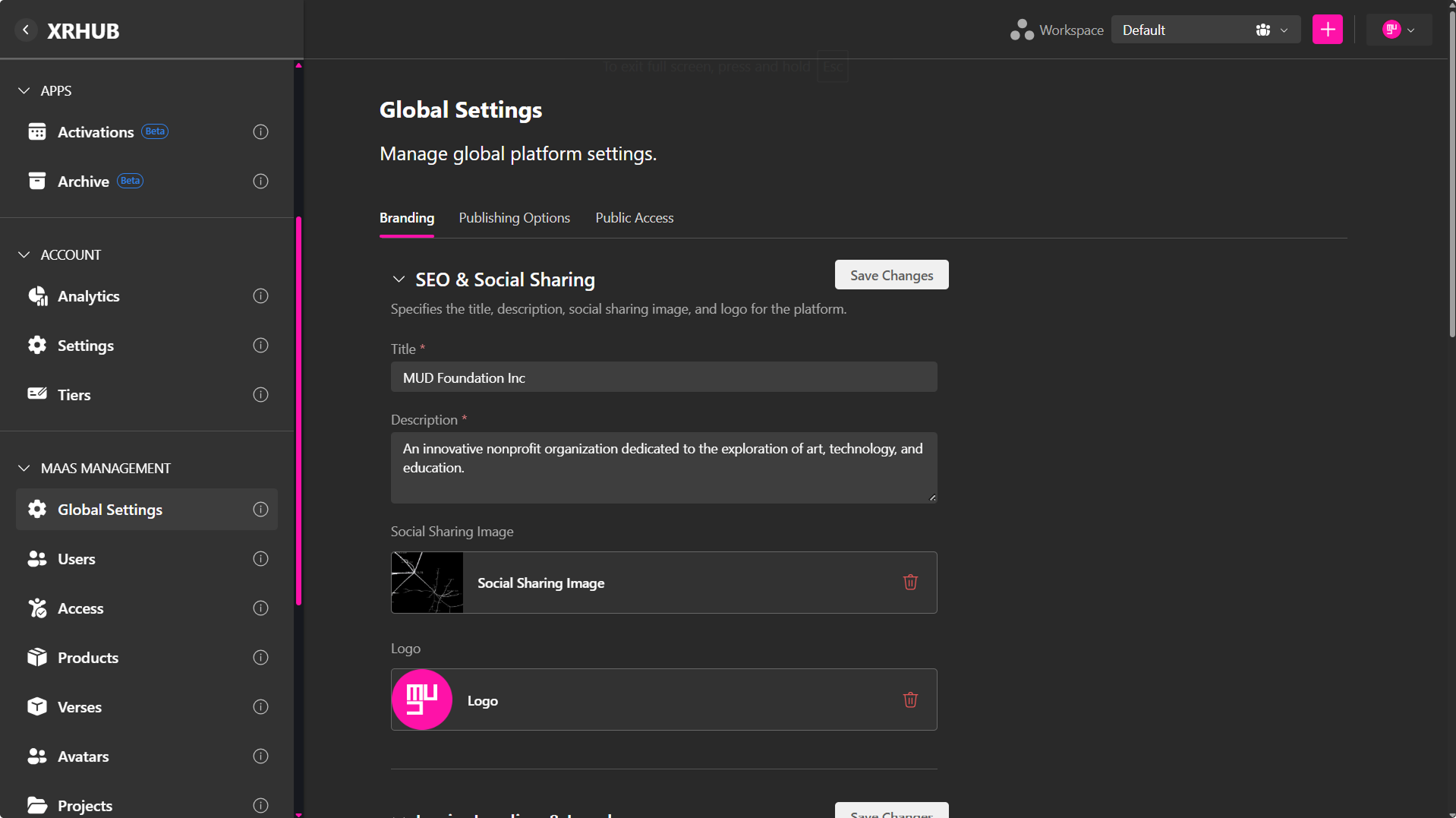
Global Settings are divided into three main tabs:
- Branding
- Publishing Options
- Public Access
Branding
The Branding tab customizes how some parts of your platform appears to users and external viewers.
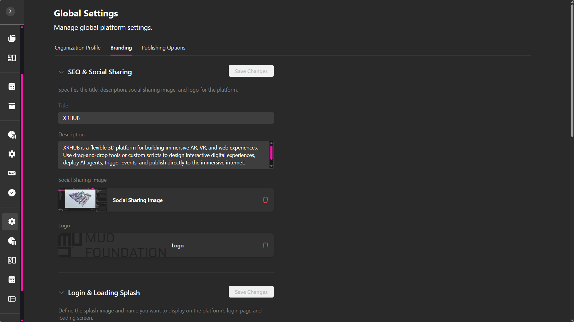
It covers visual identity, SEO metadata, and loading experiences.
SEO & Social Sharing
Defines how your platform appears when shared on social media or indexed by search engines.
-
Title
The page title displayed in browsers and search results.
Example:“XRHUB”
-
Description
A brief summary for social previews or meta tags.
Example:“Mix 3D models, architecture pieces, lighting, and images to craft custom VR spaces. Whether you envision a sophisticated boardroom or a cosmic adventure, the creative power is yours!”
-
Social Sharing Image
The default image displayed when your site link is shared on social media platforms. -
Logo
Your platform’s official logo used across the interface and in shared content.
Login & Loading Splash
Customizes the appearance of the platform’s login screen and loading interface.
-
Name
The display title for the platform in the login screen (e.g., “XRHUB”). -
Splash Image
The image shown on the platform’s login and welcome screen. -
Splash Image Credits
Attribution or credits for the splash image’s creator or source.
Example:“Photography by Gustavo Perez. New Extractivism by Vladan Joler, 2022. Media Under Dys.”
-
Loading Splash Image
The image that appears during the loading process before entering the platform. -
Loading Splash Image Credits
Attribution text for the loading screen image.
Example:“Photography by Gustavo Perez. New Extractivism by Vladan Joler, 2022. Media Under Dystopia 3.0”
Themes
The Themes section controls the primary branding color and the light and dark appearance options available throughout the tenant.
Primary Color
Primary color defines the main brand color used across supported interface elements, such as primary buttons, selected controls, highlights, and other branded surfaces.
Click Choose color to select the color you want to use.
A preview is displayed below the theme settings so you can verify how the selected primary color appears in both light and dark interfaces.
Text on Primary Color
Text on primary color determines the color used for text and icons displayed on top of the primary color.
Available options include:
- Default – Automatically uses White in dark mode and Dark in light mode.
- White – Always uses white text and icons on primary-color surfaces.
- Dark – Always uses dark text and icons on primary-color surfaces.
Choose an option that maintains sufficient contrast with your selected primary color.
Default Theme
Default theme determines which appearance users see by default when entering the platform.
Select the preferred default, such as:
- Light
- Dark
Available Themes
Available themes determines which appearance modes users are allowed to use.
You can enable:
- Light
- Dark
- Or both Light and Dark
For example, enabling both options allows the platform to support both appearances, while Default theme determines which one is initially used.
Theme Preview
The Preview area displays examples of the selected branding configuration in the enabled themes.
Use the preview to check:
- The selected primary color.
- How the color appears against light and dark backgrounds.
- The appearance of text placed on the primary color.
Saving or Resetting the Theme
After configuring the theme:
- Click Save theme to apply the changes.
- Click Reset theme to restore the theme configuration to its default values.
🔹 Tip: When selecting a primary color and text color, verify both the Light and Dark previews to make sure buttons and text remain easy to read in every theme available to users.
Publishing Options
The Publishing Options tab manages how content categories are organized and displayed across the platform.
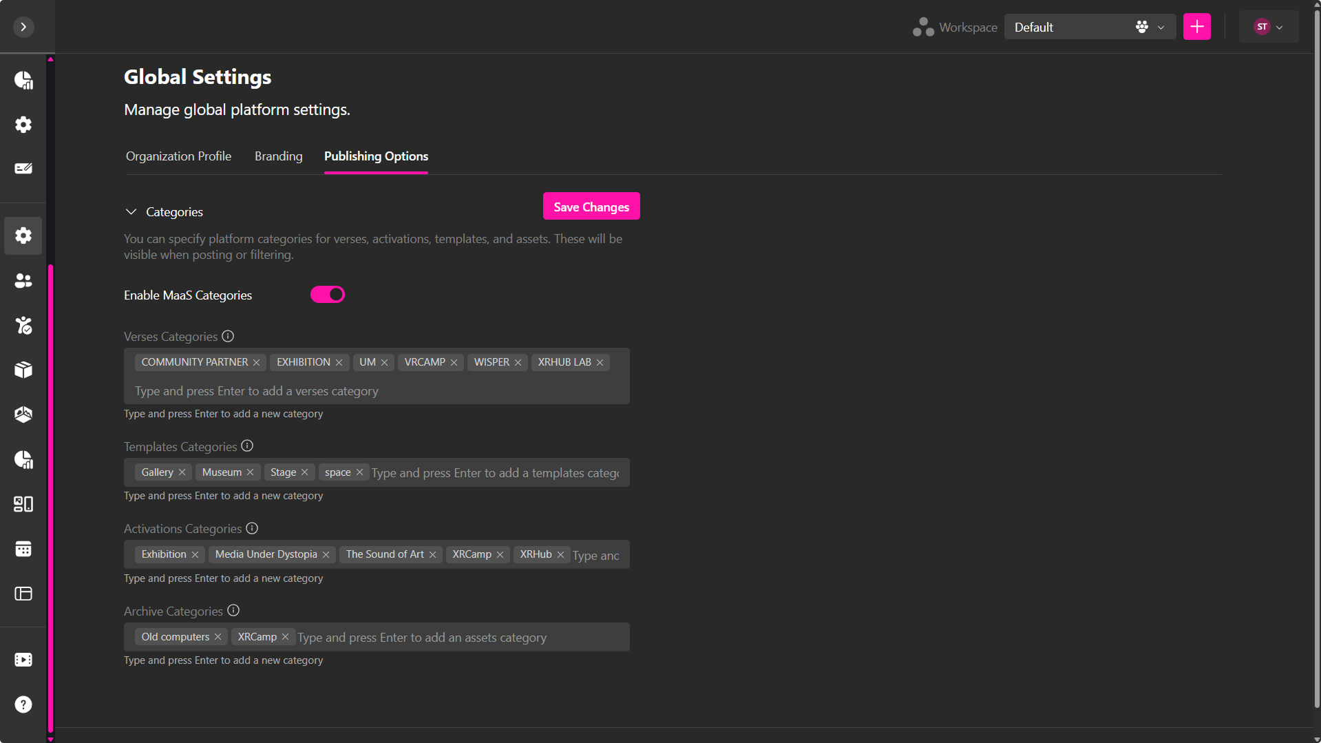
Categories
Categories define how content is organized and discovered across different areas of the platform, including the Community page and other relevant sections.
-
Enable MaaS Categories
Toggles the Metaverse-as-a-Service category system on or off, this means the system will take categories into account. -
Verses Categories
Define categories used when creating or filtering verses.
These categories appear in the Community and help organize verse-based experiences. -
Templates Categories
Define categories for templates, making them easier to browse and reuse across projects. -
Activations Categories
Define categories for activations, improving discoverability in the Community and event-related sections. -
Archive Categories
Define categories for archive resources and assets, helping organize stored content.
How Categories Work
- Categories are applied when publishing content
- Content tagged with categories becomes discoverable in:
- Community page
- Filtering systems across the platform
- Categories can be added by typing a name and pressing Enter
- Multiple categories can be created and managed for each content type
💡 Use categories to structure content clearly and improve discoverability across the platform.
Public Access
The Public Access tab controls whether public content can be viewed without requiring users to sign in.
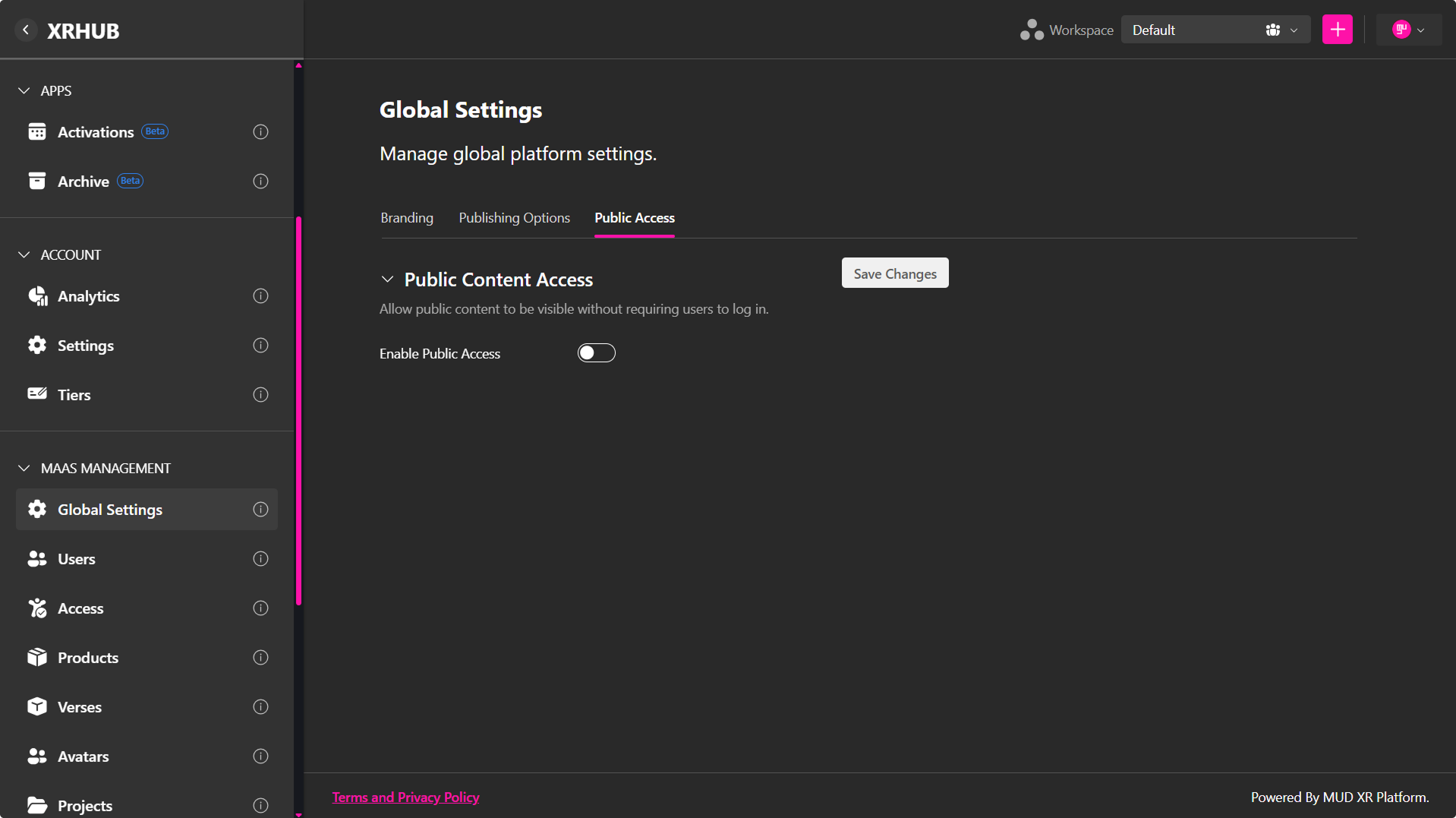
Public Content Access
The Enable Public Access option determines whether publicly available content can be accessed by anonymous visitors.
When enabled:
- Publicly published content can be viewed without signing in.
- Visitors can access public pages directly through shared links.
- Published profiles, subdomains and other public content become accessible to anyone with the appropriate URL.
When disabled:
- Users must authenticate before accessing platform content.
- Shared links redirect visitors to the login page if authentication is required.
- Only authenticated users with the appropriate permissions can view published content.
Enable Public Access
Use the Enable Public Access toggle to control this behavior for the entire platform.
- Open Global Settings.
- Select the Public Access tab.
- Toggle Enable Public Access on or off.
- Click Save Changes.
🔹 Note: This setting applies globally across the platform. Disabling public access prevents anonymous visitors from viewing publicly shared content, even if individual assets, Verses, profiles, or subdomains are marked as public.